Data visualisation is a design system
The grammar that creates visual meaning
After spending half a year understanding what makes a data viz library, I’ve come full circle to a foundational learning : data visualisation is a design system. It’s a moving, living collection of visual parts that work together to create meaning in the reader’s mind, even when the image is static.
Even if one label in the axis were misrepresented, it skews the whole reading of the chart. So there’s a grammar – rules to how we can encode shapes, lines, colours and scales with information, and how they all combine to create meaning.
This grammar is present in any type of data viz structure, whether staple (like a scatterplot) or bespoke (like one of Giorgia Lupi’s or Frederica Fragapane’s charts). At the foundation of any structure are marks and channels :
- Marks are the basic geometries that represent the data. Like lines, shapes, dots etc.
- Channels are all the different parts of the mark that can be used to add more information to them. Like its colour, size, orientation, position etc
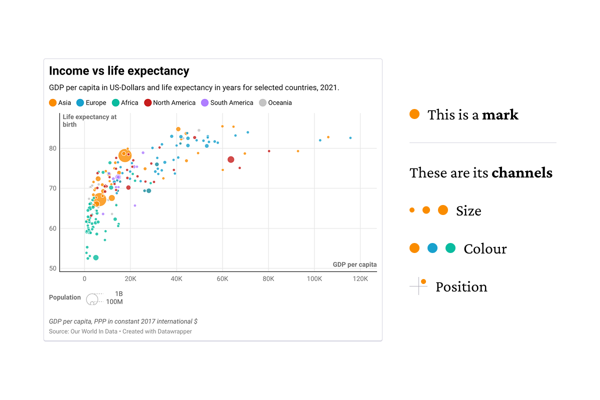
Marks and channels are just two of many ingredients, including scales and guides, that can be layered to add more function to a chart.
But why do we even need to think of it this way? It gives us a language to describe the pieces of any data viz. This language can be used to make them machine readable too. This syntax is what data viz libraries like ggplot2 and Plot are being built on.